Component Library
Website Components
Headline, Length: 15–18 words (max 3 lines) - Style: poses a question or makes a concise value proposition
Multiline test
Lorem ipsum dolor sit amet

Lorem ipsum dolor sit amet
Lorem ipsum dolor sit amet
Lorem ipsum dolor sit amet
CAROUSELS
Image Carousel
Highlight a rotating set of highlight items — programs, services or stories — in a compact and interactive format that invites exploration.
Optional Heading
Optional Section Copy

FlipCard Carousel
Highlight a rotating set of highlight items — programs, services or stories — in a compact and interactive format that invites exploration.
Explore Our Highlights
Use the arrows or swipe to cycle through featured cards.
Award & Rankings Carousel
To showcase external recognition, certifications, rankings, or industry awards that reinforce credibility and trust. This section highlights third-party validation in a structured and visually consistent way.
Awards & Rankings
News Carousel
Offer users a curated overview of topical items—articles, features or announcements—organized into filterable categories for quick discovery and deeper exploration.
News Carousel
ACCORDIONS
Accordion
Offer users a curated overview of topical itemProvide quick, scannable answers to common questions—letting users expand only the items they need and link to deeper resources when necessary.—articles, features or announcements—organized into filterable categories for quick discovery and deeper exploration.
Accordion Optional Heading
Optional Additional Copy (Leave blank for full paragraph)
FAQs
FAQ feeds from a global database of FAQs, and is linked via a JSON file. In the component, link the appropriate JSON file.
FAQ Heading
To complete your application, you must submit the following items:
- Official high school transcripts
- SAT or ACT scores
- Self-Reported Student Academic Record (SSAR)
For more details, visit our Freshman Requirements page.
CARDS
Cards (Icon)
Grid layout composed of icon-based cards, each containing a short headline and CTA, displayed in three equal columns.
Cards (Listing)
Present a small set of related items in a clean, scannable grid, allowing flexible use with three or four cards depending on content density.
Cards (Listing) with all fields populated
Optional Subhead
Lorem ipsum dolor
Optional Subhead
Lorem ipsum dolor
lorem ipsum dolor
lorem ipsum dolor
Optional Heading
Optional Subhead
Heading
Optional Subhead
Heading
Optional Subhead
Heading
All Optional Fields Blank
Lorem ipsum dolor
Lorem ipsum dolor
Lorem ipsum dolor
Lorem ipsum dolor
Three Content Cards on Gray
Lorem ipsum dolor
Lorem ipsum dolor
Lorem ipsum dolor
Phone: (561) 297-3300
Email: science@fau. edu
Address: Physical Sciences Building, Room 101
Hours: Monday-Friday, 8: 00 AM - 5: 00 PM
Cards (Grid)
Grid layout composed of icon-based cards, each containing a short headline and CTA, displayed in three equal columns.
Lorem ipsum dolor
Optional Lorem ipsum dolor subhead
Lorem ipsum dolor
Lorem ipsum dolor
Lorem ipsum dolor
Lorem ipsum dolor
Modular Cards
To present key content blocks in a flexible card-based layout that supports navigation, feature highlights, or category entry points. This component balances strong visual imagery with concise messaging and clear calls to action.
Modular Card Grid
Lorem ipsum
Keep this copy short
Cards (Vertical Image)
Card that use a vertical image size instead of Horizontal.
Vertical image card
optional
Lorem ipsum dolor
Lorem ipsum dolor
Lorem ipsum dolor
Location Cards
Cards that are image based but flip to show longer copy

Action Block Trio
Drive primary user actions by presenting three high-priority calls to action in visually emphasized blocks within a single section.
Action Block Trio Blue Background
Lorem ipsum dolor
Lorem ipsum dolor
Lorem ipsum dolor
Action Block (with 2)
Action 2

Start Your Journey
at Florida Atlantic
Lead Capture Form
Capture user information through a structured form while providing contextual value and reassurance alongside the input fields. Form ID is required.
Lead Capture Form
- Lorem ipsum dolor sit
- amet consectetur adipiscing elit.
- Quisque faucibus ex sapien vitae
- pellentesque sem placerat.
- In id cursus mi pretium tellus duis convallis.
Exec Ed Lead Capture Form
Centered CTA Band
Provide a clear, high-contrast call to action using a centered layout that reinforces support, reassurance, or next steps.
Blue
CTA Subscribe
Requires a Form ID
CTA Subscribe
text
Intro with CTA
Clean CTA content block.
Intro with CTA
Subhead
Contact Us
NOTE: Schools and Departments should use the "Subfooter Include" file to ensure persistent contact information throughout the school or department. This component is only to be used sparingly.
Heading
Optional Sub Heading
PAGE CONTENT
Split-Media Section
Guide users through a linear process or workflow by breaking it into clear, numbered steps with concise descriptions and an optional call-to-action.
Split-Media Section
Text-Media Split
Introduce a single key message supported by a relevant image, combining clarity, hierarchy, and visual context in a balanced two-column layout.
Short Headline
Image can be on the left or right. 1–3 sentences (≈ 30–40 words) Not a lot of copy on this, keep it short.
Optional Copy Line
Text-Media Split V2
Introduce a single key message supported by a relevant image, combining clarity, hierarchy, and visual context in a balanced two-column layout.
Optional Heading
- A list
- with
- some entries
Z-Grid
Present multiple related messages in a scannable sequence by alternating text and image positions, encouraging vertical reading and progressive engagement.
Z Grid Layout
Lorem ipsum dolor sit amet
Lorem ipsum dolor sit amet
Hero Split Badge
Introduce a primary entry point with a strong headline and supporting message, reinforced by a large image and a visual badge that highlights a key offering or metric.
Visual Cluster Split
Combine editorial text with a clustered set of visual elements to convey richness and activity while maintaining a single narrative focus.
Visual Cluster Split
Lorem ipsum dolor sit amet, consectetur adipiscing elit. Maecenas laoreet sem sit amet aliquam sagittis. Cras ante ante, lacinia in quam tincidunt, pretium gravida turpis. Pellentesque habitant morbi tristique senectus et netus et malesuada fames ac turpis egestas.
Two Columns Customizable
Allows for 2 variable width colums of content with alternate background colors.
Heading
- One Third
- Two Thirds Split
- Grey White
- Two Thirds
- One Third Spit
- White Gray
Downloadable Documents
To provide direct access to downloadable documents in a clear, structured format that prioritizes clarity, file transparency, and ease of retrieval.
Optional Heading
Quote Block
To emphasize a powerful testimonial, statement, or insight that reinforces credibility, authority, or emotional impact within the page narrative.
"What we've discovered could fundamentally change how we approach coral reef conservation in the 21st century."
Dr. Sarah Mitchell, Principal Investigator
TABLES
Table - Table V2 (4 column table), Table (paste an existing table)
Present a clear, at-a-glance breakdown of key cost figures—such as tuition, fees and living expenses—for a defined period or program.
Cost Overview
| Lorem | ipsum | dolor | sit |
|---|---|---|---|
| Lorem | ipsum | dolor | sit |
| Lorem | ipsum | dolor | sit |
Section Heading
| Department Name | Website |
|---|---|
| Campus Recreation | www.fau.edu/campusrec |
| Owls Care Health Promotion | www.fau.edu/owlscare |
| FAU HealthFirst College of Medicine | www.fau.edu/medicine/healthfirst |
| Office of Leadership Education and Development (LEAD) | www.fau.edu/lead |
| Dean of Students | www.fau.edu/dean |
| Counseling and Psychological Services | www.fau.edu/counseling |
| Campus Life Broward | www.fau.edu/student/broward |
| Marcus Institute of Integrative Health | www.faumedicine.org/integrative-health |
| Robin Rubin Center for Happiness & Life Enhancement | www.fau.edu/sw-cj/ssw/happiness |
| College of Social Work and Criminal Justice | www.fau.edu/sw-cj |
| Collegiate Recovery Community | fau.campuslabs.com/engage/organization/collegiaterecoverycommunity |
| Harriet L. Wilkes Honors College | www.fau.edu/honors |
| Student Health Services | www.fau.edu/shs |
| Christine E. Lynn College of Nursing | nursing.fau.edu |
| Student Government | www.fau.edu/sg |
| John D. MacArthur Campus at Jupiter | www.fau.edu/jupiter |
| Admissions | www.fau.edu/admissions |
| Graduate College | www.fau.edu/graduate |
PROOF POINTS
Icon Stat Row
Highlight a small set of key facts or proof points in a visually balanced row, reinforcing credibility through concise, high-impact information.
Why Florida Atlantic?
Block Text 01
Block Text 02
Block Text 03
Proof Points
Present a small set of key metrics or credentials in a structured row of cards, supported by a section headline and optional CTA.
Optional Heading
Number
Number
Number
Number
Number
Number
MULTIMEDIA
Responsive Image
To deliver a strong visual statement that supports storytelling, brand positioning, or thematic transitions between sections. This component prioritizes imagery over text and is used to create emphasis, pause, or emotional impact.
Five-Block Grid
Present a curated set of five related content blocks with intentional visual hierarchy, guiding attention through varied block sizes and emphasis.
Optional Section Heading
FIND IT FAST
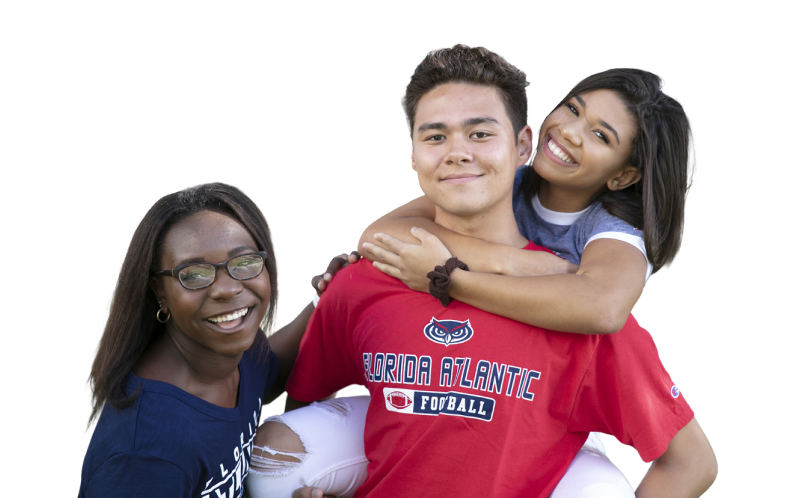

Column one - Block three heading
Column one - Block three detail
Juicer feed goes here
YouTube Video
To deliver rich, narrative-driven content through video, supporting storytelling, testimonials, research highlights, program overviews, or institutional messaging. Requires YouTube Video ID.
Google Map
Requires a Lat and Long, to get that go to google maps and right-click on the map where you want the pin to be, and click the Lat/Long to copy it to your clipboard.
Optional section heading
Optional section copy
Optional content Heading
26.372502499533425, -80.10403734230046
Countdown
Surface a single, high-priority deadline with a live countdown and link to next steps.
Countdown Deadline Panel
One short, supportive sentence (≈ 20–25 words)
Formats as DD : HH : MM (days, hours, minutes)
Tabs
To organize and filter categorized content within the same page context without requiring navigation to separate pages. This component improves content discoverability and reduces cognitive load by grouping related items under clear labels.
TILES
Steps
Guide users through a linear process or workflow by breaking it into clear, numbered steps with concise descriptions and an optional call-to-action.
Steps can be Blue or Red
Lorem ipsum optional text
Step 1
Step 01 Description - Lorem ipsum.
Step 2
Step 02 Description - Lorem ipsum.
Step 3
Step 03 Description - Lorem ipsum.
Cards (Grid text only)
To present a structured list of related links or resources in a compact grid format without relying on imagery. This component prioritizes clarity, density, and scannability for secondary or utility-level content.
Lorem ipsum dolor
Optional Subhead
Cards (Stats Colored)
Three tiles with interesting colors to draw attention.
89%
Lorem ipsum dolor
55
Lorem ipsum dolor
100
Lorem ipsum dolor
Social Grid
To display curated social media content in a structured grid layout that reinforces brand presence, recency, and community engagement. This component visually connects the website experience with external social platforms.